Thursday 26 February 2015

Week Nine: Dichotomy Characters


The next project we were given was to produce two characters that work in a dichotomy with one another. The basic work we needed to do for this project involves collecting research to help produce a foundation to build upon and influence the designing stage. We are to concept both characters, evolving the design through its surface detail and colour schemes. We then need to model one of the two characters and producing orthographic view for the modelling stage. If we had enough time we could also implement stretch goals. Examples of this include rigging the character, modelling both of the characters, and animating the rig.

In our seminar we looked at interesting words which could be used as a foundation to build upon our designs and we were asked to produce a list of them. When we chose the words we liked we produced a Venn diagram which outlined the differences and similarities between these two elements. 
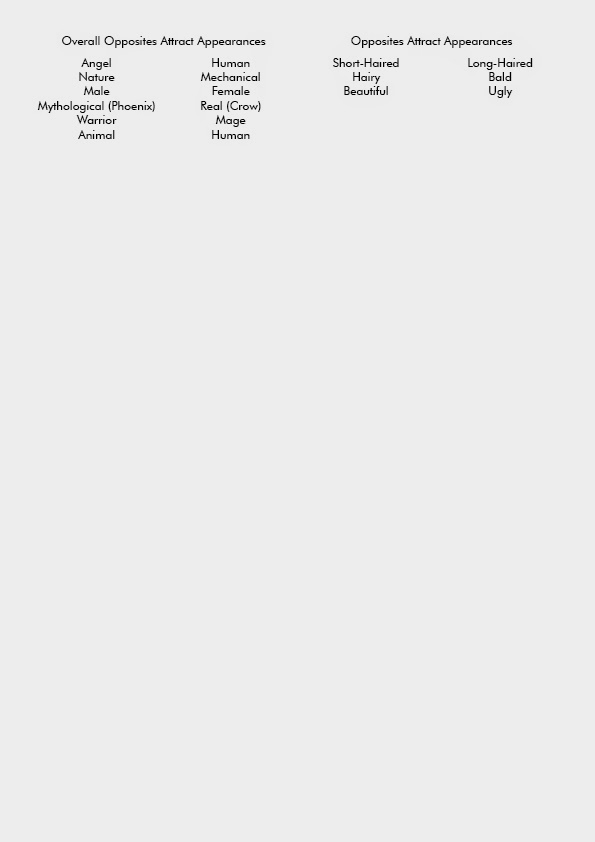


During this seminar we were shown how to produce characters from primitive shapes. I personally struggle with creating characters from scratch using this technique. I feel it’s helpful when you have an idea of the character you want to create but want to experiment with.
The two words I settled on was Wabi-sabi and Kintsugi, two Japanese design philosophies which oppose one another yet tied together. I was introduced to Kintsugi after I was speaking to a friend about wabi-sabi, she noticed the similarity between the latter and the former when I was telling her about it. Wabi-sabi is a philosophy about living in a way where you embrace the imperfections, natural growth and decay of life. Kintsugi is about breakage repair becoming part of history rather than something to disguise. It’s also a technique where gold, silver or platinum is used to fix broken pottery. Each of these philosophies are about embracing the negative and seeing them as positives.
Using the Venn diagram to visually show the similarities and differences between the two philosophies. I also was able to develop ideas which could affect the visual side of creating a dichotomy. Wabi-sabi felt nature influenced due to the usage of terminology, whereas Kintsugi was a mechanical influence due to it being a hobby about repairing. 

My characters


This character would heavily depict decay throughout her design, with plant life relating to death lifted over her body. Plant life such as mould. The character’s facial structure would bare heavy resemblance to a skull. The spinal-cord would have flowers and plant life blooming out of it to highlight the importance of this element in the human body.

The mechanical character was going to be based upon mining equipment to reinforce the settler role.


Wall-E 0.5
Also at the time of making this character, I saw Wall-E's character and not the film, so I had no clue about Wall-E also being a mining robot. 

Presenting My Two Characters

Reception of the two characters were mixed. The most important influence on the direction of the project was to be told to redo the characters. These two characters were created from a written foundation, I was recommended to produce characters from a visual foundation. The difference between a written and visual foundation is that you box yourself in with the former. You have words to base your design on which can make your choices fairly limited for the character. With a visual foundation you can base your character of the silhouette meaning you are only boxed in by the most defining forms.
The nature character received positive reception, being told that I should save it for my portfolio and work on it at a later date. The mechanical character received mostly neutral reception being told that looks too much like Wall-E, as I later found out was a mining robot. The two characters were also depicted in different medias, with the nature character being done in traditional media, pen and pencil crayon, whereas the mechanical character was designed photo shop, which didn’t have the depiction of the dichotomy. I was also told that the two characters didn’t their resemblance to one another enough. I felt but linking the two character on a written foundation would pose the dichotomy through their actions. I was thinking to rationally I was not allowing myself to have fun which would have produced a much more interesting dichotomy.
It was recommended to me just to scribble on a page and try to produce silhouettes from them. And so my short term destiny was revealed to me.

Week Eight: My Finished Turret

So this is my sentry turret it’s… 


Yup it’s definitely a sentry turret.
So if you can tell I’m not really too happy with it. I purposely tried to focus on texturing on this project as I consider this to be the biggest issue I currently have in asset production. I feel that getting the silhouette correct, reducing the geometry down that doesn't affect the form and high quality texture detailing are the most important elements in asset production, and while I feel I can do the first two aims, I struggle with the latter one. I've tried to tackle texturing by giving myself a large amount of it to do, this at first might seem defeating. Why would you have a lot of texturing? Aren't you stretching yourself so thin? Well my thinking was, at the start of the first year we were taught the basics then told to model a 1500 tri dalek. We were literally thrown in and taught to learn it. My thinking was along these lines; If I have a lot of texture work, then I’d be forced to improve on texturing because of the amount of work I have to conquer. It’s forcing me to confront what I’m bad at and improve via the sheer work load. This way does have some really negative down sides to them, such as sheer amount of work. I have to produce an Albedo, Normal, High map, Roughness and metalness maps. As well as having a try with an ambient occlusion map which will have to be made by hand. The ambient occlusion can be created in both Unreal 4 and 3ds max, but due to the geometry being quite flat and most of the detail in the texturing, it has to be created by hand unless there’s a way I haven’t found out that I can do. I also have to be precise with my time management skills, which… I’m also not too good with, especially when the first part of this project was moving incredibly slow. With the concepting taking over a week and struggling to bring fruition out of it. This severely impeded on the rest of my project.


Most of the geometry is a flat surface where a normal map was used to produce the design.
      Now with that over, I’ll talk about my final model. I've always liked dragons and recently I've grown fond of deers. Believe me this is going somewhere. So originally I wanted to base my sentry turret off a Japanese dragon, and during research I came across a Qilin.
So Qilin’s are basically a mythical hooved chimera, which is considered the eastern equivalent of a unicorn… even though it has two horns. The animals I see in the design are a deer and a dragon. The other thing I took notice of with the Qilin is that it’s believed to be the strongest creature in mythology, beating out the Phoenix, then the dragon. Also in my research I came across Japanese samurais, who would wear creative demonic masks to scare their opponents. So basing the turret off this war philosophy and using the Qilin as a base, I've tried to create a turret which captures Japanese war culture.
The modelling stage of it was fairly easy. Lots of flat surfaces with texture detailing, meaning I could significantly reduce the tri limit down and not affect the silhouette or UVs. The only difficult bit was producing low poly antlers which because they curved heavily, was quite difficult to accomplish as well as time consuming.
     Over all, I’m really not happy with the turret’s texture and I aim to improve on this area of the asset production. Ways of doing this involves me looking into other PBR maps created by the game design community as well as looking at the materials that I’m supposed to be texturing. Elements to look at would include the amount of light reflected or absorbed by the material.

Week Seven: Texturing Hell


     Continuing immediately from last’s week blog post, over the weekend I modelled the final turret model. I used the previous model as a foundation, to cut down the amount of time I’d spend on modelling as I left too little time for texturing. I’ve mentioned a couple of time before on this blog, that I feel that I’m awful at texturing, and so I need to make sure I spend enough time on this section. I'm also in the camp that texturing is incredibly important for an asset, more so than modelling. Voxel games and pixel games have shown me how important it truly is.
Minecraft is probably the most well-known voxel game.
If I made all the blocks colourless, it’ll be incredibly difficult to make out the forms of the objects. This is probably the most extreme example I can think off to explain my thought process.
The modelling part of the asset production is something I feel quite confident in, especially low poly modelling. With a model cap of 5000 tris to make the turret, I could use the tris to smooth out any cylinders or rounded edges as well as producing elaborate antlers which feature heavily in the design.  


Modelling the basic form of the turret was done quite quickly, with the only significate amount of time spent on modelling the antlers, which also turned out to be the most time consuming section of the unwrap as well. The unwrapping was quite tricky for this model, as there was some geometry which was awkwardly placed inside the main cannon. Other than that, it was quickly done.


But now we get to the bane of asset production for me. Texturing. I started off adding the basic colours to create the albedo layer, each colour having its own layer. This makes the work flow easy for me, as well as none destructive via the usage of clipping layers and masks.


              My finished roughness, normal and albedo. Looking at back at these maps, I can see some of the crucial mistakes I have made on these maps. The Albedo map isn't too bad but looks odd with the paintly texture and the photobashing of the rust onto the cannon. The roughness map is all just block colours and instead it needs to be broken up, such as adding more values to the block colours. The normal map has sharpness to it, which creates a sharp transition from the flatness to the indent which for some parts, does not work. 

Monday 23 February 2015

Week Twenty One: The Final Form of the Caterpillar

     I'm going to do another, what I like to call, Quick Fire blog. This is where I just write a few sentences about the drawings and just post the pictures up to speak for me.


     So Monday morning started off producing quick designs of the two final character. I quickly did drawings of their faces, the quick drawings of the bodies. I finished the render of the right caterpillar, and did a quick value pass of the left caterpillar. I really struggle with values and lighting so I feel that's what hindered me on the right caterpillar.


    Tuesday involved me finishing the painting of the values on the left caterpillar. The  face was changed up to make him look more grumpy and dominating.


    Wednesday involved me producing colours for the caterpillar. I was unsure about what colour he would be. Survival wise, it would make more sense for him to be a green colour, but most depictions of the caterpillar are blue in the Alice in Wonderland, yet I'm unable to find any reference to him being blue in the original manuscript or book. During this day, I also decided to design the shisha he smokes as well as the colours.


4 and 7 was the most liked shisha designs out of the 12.
I combined 4 and 7 to make more designs after a team member said they liked the top to 4 and the whole design of 7.
Add colours, 3, 4 and 5 were the most liked colours. 3 was the most liked silhouette.

     On Thursday I had a CV workshop aimed at being able to produce a CV which answers to game industry ads correctly and how to write an effective cover letter. Work relating to the Off the Map project involved me produced waistcoat patterns for the left hand side caterpillar. It was recommended to me by a team member that I was to change the legs of the left caterpillar as his legs were too beetle like instead of caterpillar like. I changed up the legs to reference from a caterpillar more.


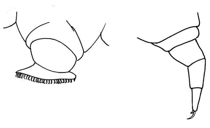
These are the caterpillar legs and feet in case the pictures didn't give it away. (Also I have nothing informative to add as the picture the the left does that for me.

It was suggested to me to change the arm places to make the form for dynamic.


      Friday, the final working day, involved me producing Orthographic of caterpillar. So I could start modelling as soon as possible. As it was close to the end of the day when I finished the Orthographics, I decided to model the shisha. I only partly got it finished, but it shouldn't take too long to finish it off now.